Hi I'm Britney!
I specialize in digital transformation for small businesses, creating websites that are not only visually appealing but also inclusive, user-friendly, and search-optimized. My goal is to help businesses thrive in the digital landscape.

Marlayna Photography
Website Redesign
UI/UX, User Research, Website Redesign, Professional Project, Small Business

Spotify
Feature Concept Update
UI/UX, User Research, Mobile App, Course Project, Concept Design
At-a-Glance
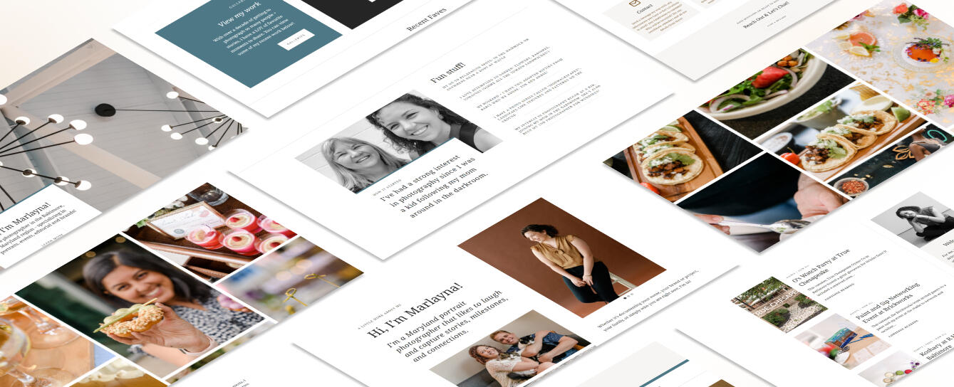
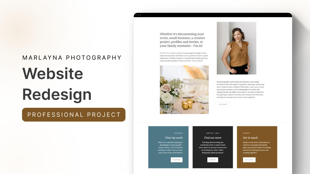
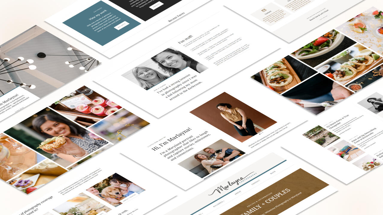
My collaboration with Marlayna Photography centered around amplifying Marlayna's online presence through a revitalized website that not only showcases her exceptional photos but also provides better discoverability and creates a seamless user experience.This case study takes you behind the scenes of our strategic journey. From enhancing website flow and design via WordPress theming to optimizing search engine visibility, every step was meticulously crafted to amplify Marlayna Photography's reach.
Problem
Marlayna aimed to shift focus from weddings to small business branding, corporate events, and families. This exciting shift demanded a refreshed online presence to help her business bloom and connect with her ideal clients.
Marlayna's website posed a few challenges: outdated design, sparse content, and keywords that needed a bit more love. Confusing layouts on certain pages only added to the desire to improve.
Solution
We aimed to captivate visitors with an updated visual aesthetic, streamline navigation for a user-friendly experience, and effectively communicate her transition to branding, corporate events, and family photography in a way that was mindful of her previous clients, and welcoming to future clients.
By optimizing content and ensuring mobile responsiveness, we aspired to drive engagement, generate leads, and ultimately foster growth within these evolving markets.


Process
I approached Marlayna's site revamp with a holistic strategy. I redesigned the visual elements for a modern touch, restructured content with focused messaging on her new direction, and optimized keywords for improved discoverability. Seamless navigation, mobile responsiveness, and integration with social platforms rounded out my comprehensive approach.
SEO & User Experience Audit
The first step was to conduct an in-depth assessment of Marlayna's existing site to identify SEO gaps and user experience bottlenecks. Insights from this audit informed my strategic direction for the revamp, setting the stage for a more effective and engaging online platform.
Check out the full audit → HERE
Remote User Testing
Next, I collaborated with Marlayna to design a remote user test where participants interacted with her old website. Through their feedback, we gained invaluable insights into usability issues, content effectiveness, and overall user satisfaction, shaping our site improvement strategy.

Keyword Research
I performed comprehensive keyword research to pinpoint optimal terms for Marlayna's new site. By aligning keywords with her offerings and target audience's search intent, I aimed to boost her site's visibility and relevance across search engines while not losing the established visibility she naturally had already had growth in.

Wireframing
I collaborated closely with Marlayna to prepare a wireframe, outlining the site's structure and content placement. Additionally, I assisted her in selecting a WordPress theme that aligned with her design vision while prioritizing optimization and user experience.

WordPress Design & SEO Implementation
The wireframe was translated into action by preparing and implementing the WordPress block elements onto Marlayna's new site, carefully integrating the chosen keywords within relevant content blocks. This ensured optimal on-page SEO while maintaining a cohesive and engaging user experience.

Google Analytics Tracking
Introducing robust Google Analytics tracking to Marlayna's revamped site provided valuable insights into visitor behavior, traffic sources, and engagement patterns. Through meticulous configuration of analytics, Marlayna was empowered with data-driven decision-making tools, enhancing her understanding of site performance and audience interactions.
Design Iterations
Iteration number 1: Enhanced home page design
Marlayna’s original home page lacked content that users could browse and a clear call-to-action. By updating the home page to have headings and helpful information Marlayna’s engagement increased by 17% from June to September 2023.


Iteration number 2: Eliminate double navigation
The original design of Marlayna’s website included two navigation bars. While the double navigation didn’t seem to impact user interaction, having one main navigational bar does clean up the website’s overall look and cuts out any potential user confusion that could arise.
Iteration number 3: Structured pricing to highlight services
After conducting a usability test, it was clear that users found Marlayna's offerings confusing and uncertain. To address this, I redesigned the initial pricing page into a landing page. Now, users can easily view all of Marlayna's services without scrolling through a list with descriptions and images. This allows them to make a quick selection based on what they are looking for.

Final Design
Check out Marlayna Photography’s full website! → Marlayna Photography
What I Learned
Collaborating with Marlayna to understand both her needs and those of her users was an insightful experience in finding the right balance. From the project's outset, it was clear that Marlayna aimed to shift away from certain aspects of photography. However, I recognized that streamlining her site wouldn't be a straightforward elimination of services. Marlayna sought a mindful transition, respecting her past clients and minimizing disruption.I kept in mind that the structure needed to be concise and easily updatable for Marlayna. Additionally, the language had to effectively guide diverse clients to the specific areas they were seeking. Navigating this balance was crucial to the success of the project.In the course of my first professional project, I discovered the importance of adaptability in delivering information. Recognizing Marlayna's preference for to-do lists, I crafted a list that streamlined communication and clarified the information needed to refine the site. While this approach might not suit everyone, understanding the unique personality of each stakeholder emerged as a key factor in achieving effective communication outcomes in the future.
See more

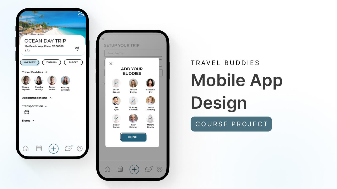
Travel Buddies


Spotify

At-a-Glance
In the dynamic realm of modern travel, the quest for crafting memorable family vacations and group adventures can be both exhilarating and challenging. The need to collaboratively plan, organize, and execute these journeys with precision has inspired the creation of my innovative solution: the Travel Buddies application.
Problem
The design problem I sought to address is the lack of a comprehensive, user-centric platform that caters to the intricate needs of individuals planning family vacations and group trips.Existing tools and applications often fall short in facilitating seamless collaboration, centralizing trip information, and offering personalized planning experiences.
The design challenge at hand was to develop a digital solution that not only overcame these barriers but also transformed the way travelers coordinate their adventures.
Solution
I created the Travel Buddies prototype and worked with a small group of users to test the various features that I identified through a user needs evaluation as being the upmost important.
Users noted that the app was easy to understand, navigate through, and jump right into and that they felt as if they’d instantly be comfortable in their abilities to collaborate on trips if the app were to be fully developed.


Process
After conducting a comprehensive user needs assessment and a thorough competitive analysis, I confidently began the design process for Travel Buddies. I started by creating rough sketches, followed by a paper wireframe and a low-fi prototype. To gather valuable insights and evaluate the current features and progress of Travel Buddies, I conducted a usability test with three participants.
User Research
After conducting a user needs analysis, I created two user personas that focus on different categories of individuals. The first persona represents a busy mom who is frequently responsible for organizing family trips. She is looking for an organizational travel application that meets her specific needs.The second persona represents a freelance photographer who travels for both work and pleasure with friends. This persona needs a tool to help them stay on budget by organizing their trip itineraries.


Sketches
I began with initial sketching to ideate and visualize the core features and user interface elements of Travel Buddies. These sketches provided a starting point for the application's design, ensuring that it catered to both busy parents and adventure enthusiasts.
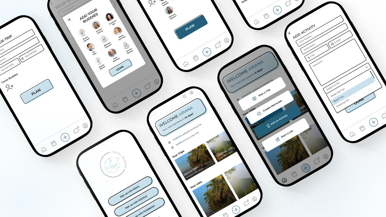
Wireframe & Low-Fi Prototype
I created wireframes and a low-fidelity prototype to outline the application's layout, navigation, and basic functionality. These wireframes served as a blueprint for the user interface design, aiming to provide a user-friendly experience for all types of travelers.


Med-Fi Prototype
As the design of Travel Buddies progressed, I transitioned to a medium-fidelity (med-fi) prototype. This interactive prototype retained the core functionality and layout envisioned for Travel Buddies while introducing more refined design elements, such as detailed user interface components, navigation flows, and a closer representation of the final visual aesthetics.The med-fi prototype played a crucial role in enhancing the user experience and preparing for user testing.

Usability Study
The usability test involved three participants, each representing different user segments within the Travel Buddies target audience. Participants included individuals from various backgrounds, including busy parents organizing family vacations and adventure enthusiasts coordinating trips with friends. All participants had prior experience with travel planning and were open to collaborative vacation planning.

Design Iterations
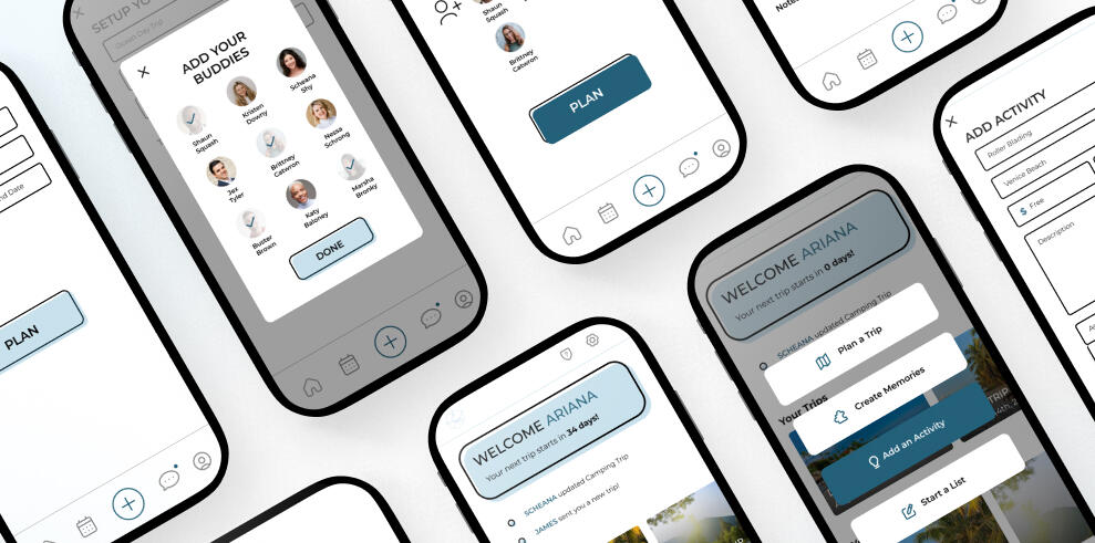
Iteration number 1: A static menu helps keep users focused
During user testing with the low-fi prototype, users found the + button and the hamburger menu (left) to be more tedious than helpful. Creating a static menu (right) enhanced usability and streamlined task completion.


Iteration number 2: Conversational comments section on trips fuels more connection
Users commented that leaving feedback on activities felt a little clunky and did boast conversations. Users had a desire for a chat-like feel so that interaction would be boosted.
Final Design
Check out the Prototype to set up a trip & add some friends! → Travel Buddies
What I Learned
In the course of this project, my confidence in design has experienced significant growth. Navigating through every stage of the process has been instrumental in refining both my creative instincts and presentation skills. Commencing with a design problem, progressing through the intricacies of user needs and competitive analysis, and advancing to the realms of wireframing and prototyping have collectively contributed to this transformative journey.Being solely responsible for every facet of the application, from conducting user testing to meticulously crafting the final design, has provided a unique opportunity to delve deep into my reservoir of creativity and problem-solving skills. This project has served as a crucible, forging a stronger, more assured designer in its wake.
See more
Spotify


Marlayna Photography

At-a-Glance
In my project focused on enhancing Spotify's music discovery experience, I conducted in-person user interviews and usability tests, uncovering user frustrations with the existing interface, particularly the Smart Shuffle feature. By redesigning the interface, I aimed to prioritize clarity, intuitive design, and improved recommendations, making music discovery more user-centric. Insights from the project underscore the importance of clear interaction design and user preferences, ultimately contributing to a more engaging and personalized music discovery experience within the platform.
Problem
In my analysis of user experiences with Spotify's music discovery features, two significant challenges emerged.Firstly, users encounter usability issues, such as misunderstanding certain icons and encountering design changes that lead to confusion and dissatisfaction.
A circle icon within the queue has caused confusion as it was mistaken for adding songs to playlists when in reality its purpose was to remove songs.
Secondly, there's a need to balance algorithmic music recommendations with personal preferences, as users desire more diverse recommendations and better control over music discovery.
Solution
To address these challenges, Spotify should prioritize clear design and intuitive iconography, ensuring that users can interact seamlessly with features and that design changes are well-explained. Consistency across platforms is essential for user familiarity.
A successful outcome for Spotify would be a refined interface that is intuitive, user-friendly, and consistent across platforms. This would result in increased user engagement, satisfaction, and a more personalized music discovery experience.


Process
I conducted in-person user interviews and usability tests of Spotify's interface, focusing on the Smart Shuffle and queue features, revealing significant user frustrations with the current interface. Following this, I designed an alternative layout and conducted a preference test using a System Usability Scale (SUS) survey to gain deeper insights into users' experiences with the two interface versions.
Interview & Usability Testing
The interview and usability test of Spotify's mobile app provided valuable insights into users' current frustrations with music discovery on the platform.By recording user interactions with the application, I constructed an affinity wall to categorize and systematically organize the issues users encountered as they navigated the app, performed tasks like adding music, shuffling songs, and shared their typical methods for discovering new music.

View within Miro → Spotify Affinity Wall
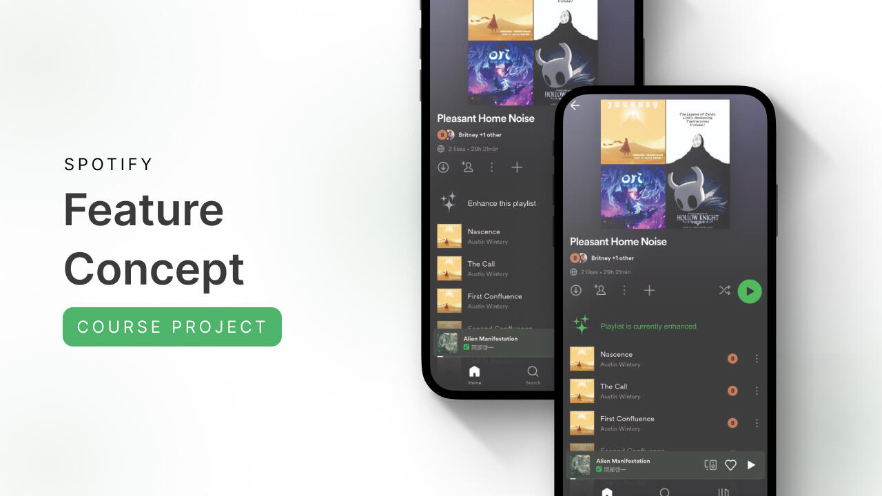
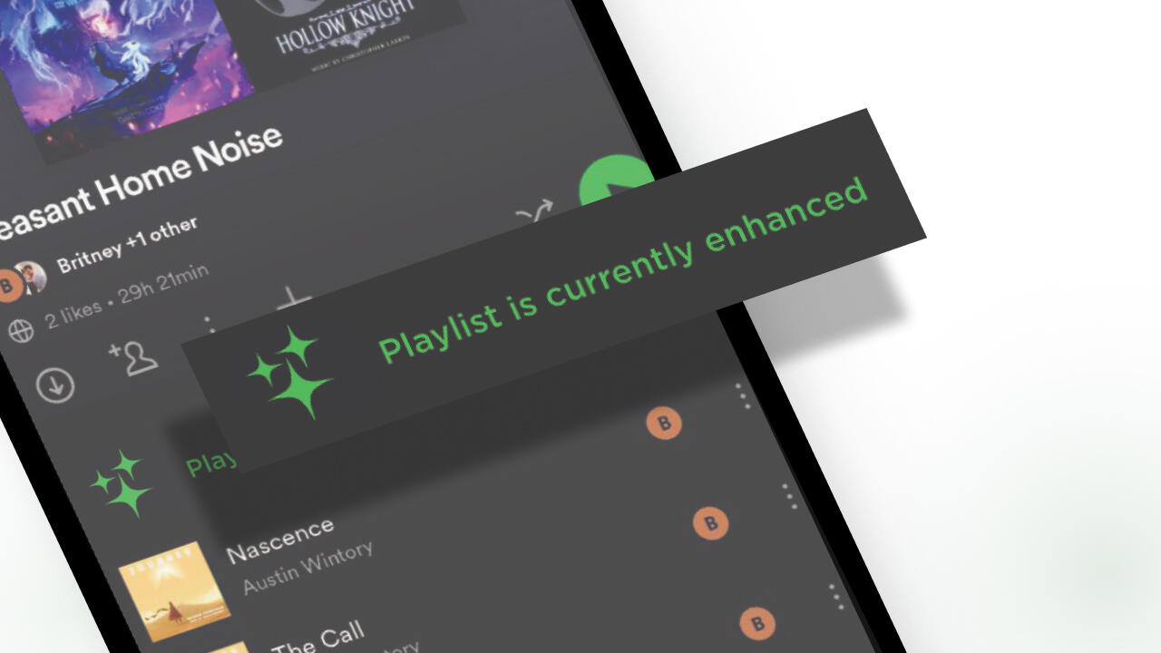
Feature Concept Redesign
My primary goal in redesigning the Smart Shuffle feature was to enhance the clarity and simplicity of music discovery for users. The original design tucked this feature behind the shuffle icon, but concealing a new music discovery function within established iconography proved unclear for users. In my conceptual redesign, I extracted the feature from behind the shuffle button, transforming it into a standalone, user-controllable element that users could easily activate or deactivate at their discretion.

Preference Test
The questionnaire was structured to allow participants to view both Layout A (Spotify's current interface) and Layout B (my concept design) consecutively. Each participant went through a series of questions that followed the System Usability Scale (SUS) survey method. This sequential approach enabled direct comparisons between the two layouts.Participants were friends, family, and found through Coursera class message boards. Please note that the image with the clearer feature may receive preference due to the inability to zoom on Google Forms.
Check out the test → Spotify Preference Test

SUS Score Results
The survey results indicate a preference for Layout B (my concept design) over Layout A (Spotify's current interface). Participants found Layout B to be more user-friendly, less complex, and quicker to learn, leading to a higher likelihood of frequent use. The results still indicate a need for continued improvement as Layout B still had some participants score below average.
Design Concepts
Concept number 1: No more hide and seek for the Enhanced Shuffle feature
Users were frustrated by the shuffle icon also containing the enhanced shuffle feature as they didn't enjoy new songs being added to their playlist and would prefer the shuffle icon to only shuffle the songs they selected on their playlist. Giving users the capability of enhancing their playlist as a separate feature could alleviate frustration and confusion.


Concept number 2: Cleaning up the queue
The current state of Spotify's queue presents several usability challenges that require significant improvements. Icons used for rearranging songs resemble menus, causing user confusion, and the circular button next to songs lacks clarity regarding its function. Additionally, there is a lack of an intuitive means to directly add songs from the queue to playlists. Streamlining the queue and introducing essential features would substantially elevate the overall user experience and enhance music discovery enjoyment.
Final Thoughts
My analysis of user experiences and preferences within Spotify's music discovery features highlights the importance of clear interaction design and a balanced approach to music recommendations. The insights gathered serve as valuable feedback to guide the platform's future enhancements, ensuring a seamless, engaging, and personally tailored user experience.
What I Learned
This project marked my first foray into addressing pain points within an established brand while proposing enhancements. The research, observation, and concept design phases were not only insightful but also enjoyable. It allowed me to scrutinize a service I frequently use, identifying both user successes and challenges, ultimately uncovering avenues for application improvement.The experience served as a catalyst for me to examine other well-established designs and consider opportunities for refinement. The key takeaway from this project is the recognition that, regardless of user base or years in operation, brands must continually strive for enhancement, ensuring the creation of a welcoming user environment.
See more
Marlayna Photography

Travel Buddies

SEO & UX Services
I know from experience that every small business is unique and I also know that every small business have fluctuating budgets based on the season. That's why my approach to optimizing user experience and boosting search engine visibility is like a customizable LEGO set—modular and budget-friendly.
Each of my collections can be combined with another or kept separate to focus on specific improvements. Our collaboration on creating a captivating plan for your business will not only improve metrics but it will also shine a brighter spotlight on your talent. I'm looking forward to chatting with you about your needs!

Foundational SEO | $350
Whether you're embarking on your online journey for the first time or are a seasoned business owner, my search engine optimization services are designed to lay a solid foundation for online success. This collection includes:• Content Strategy Development: Assist in planning content strategies tailored to your business goals and target audience.• Keyword Research and Analysis: Identify relevant keywords and phrases to optimize your content.• Competitor Analysis: Provide insights into your industry competitors' strategies and market trends to inform your content approach.• Backlink Strategy: Develop a list of high-quality backlink opportunities to improve your website's authority and ranking.• On-Page Optimization: Implement on-page optimization strategies such as meta tags, headings, and content optimization to enhance your website's visibility and user experience.

UX Essentials | $600
Your user experience (UX) should be a main focus when building your business or improving your business over time. My services include:• Interface Planning: Collaborate on designing intuitive and user-friendly interfaces for your website, ensuring a seamless user experience from the outset.• Visual Design Assessment: Review visual elements such as layout, typography, and color scheme to create a visually appealing website that aligns with your brand identity.• Call-to-Action Optimization: Assess and optimize your CTA items to ensure they are strategically placed and encourage user engagement, enhancing conversions for both existing and upcoming websites.• Accessibility Considerations: Evaluate your website's accessibility features to ensure inclusivity for users with disabilities, prioritizing accessibility from the early stages of website development.• Performance Optimization: Work on improving website performance and loading times, enhancing the overall user experience for visitors.
Case Studies
Marlayna Photography

Travel Buddies

Spotify
